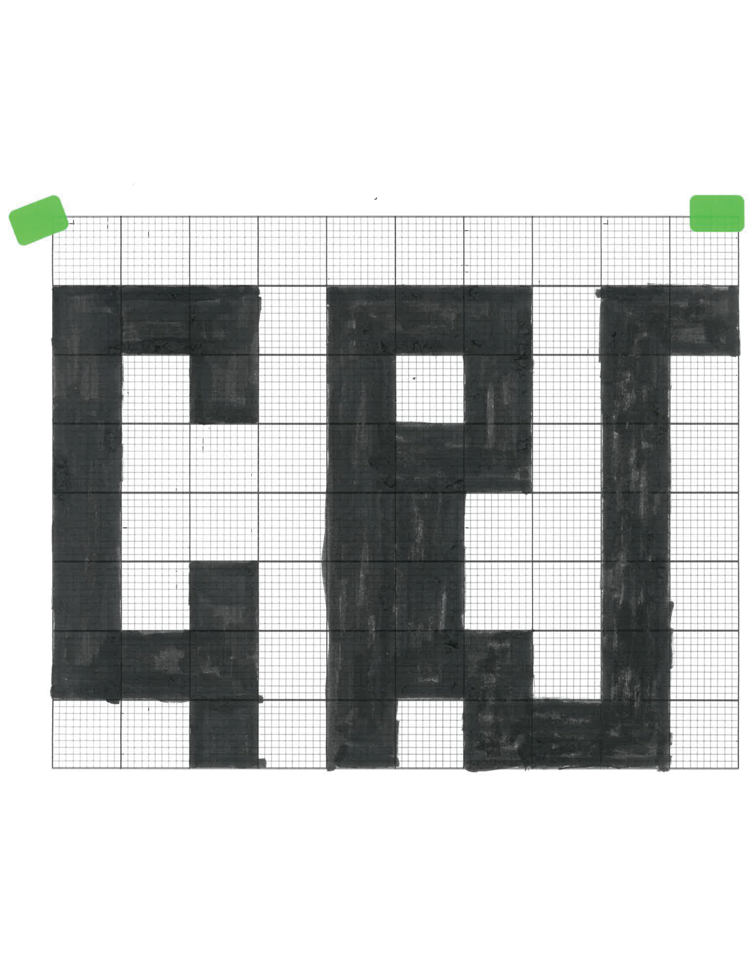
Bitmap Monogram
The process behind the design consisted of cutting each letter into two or three pieces, segmented slightly from each other. This was used to create a sense of visual cohesion throughout all the letterforms. In an effort to make each individual letter visually appealing, the center R was made slightly larger than the other two. This serves to create a sense of individuality by separating each letter from each other, creating a subtle sense of uniqueness.
Final


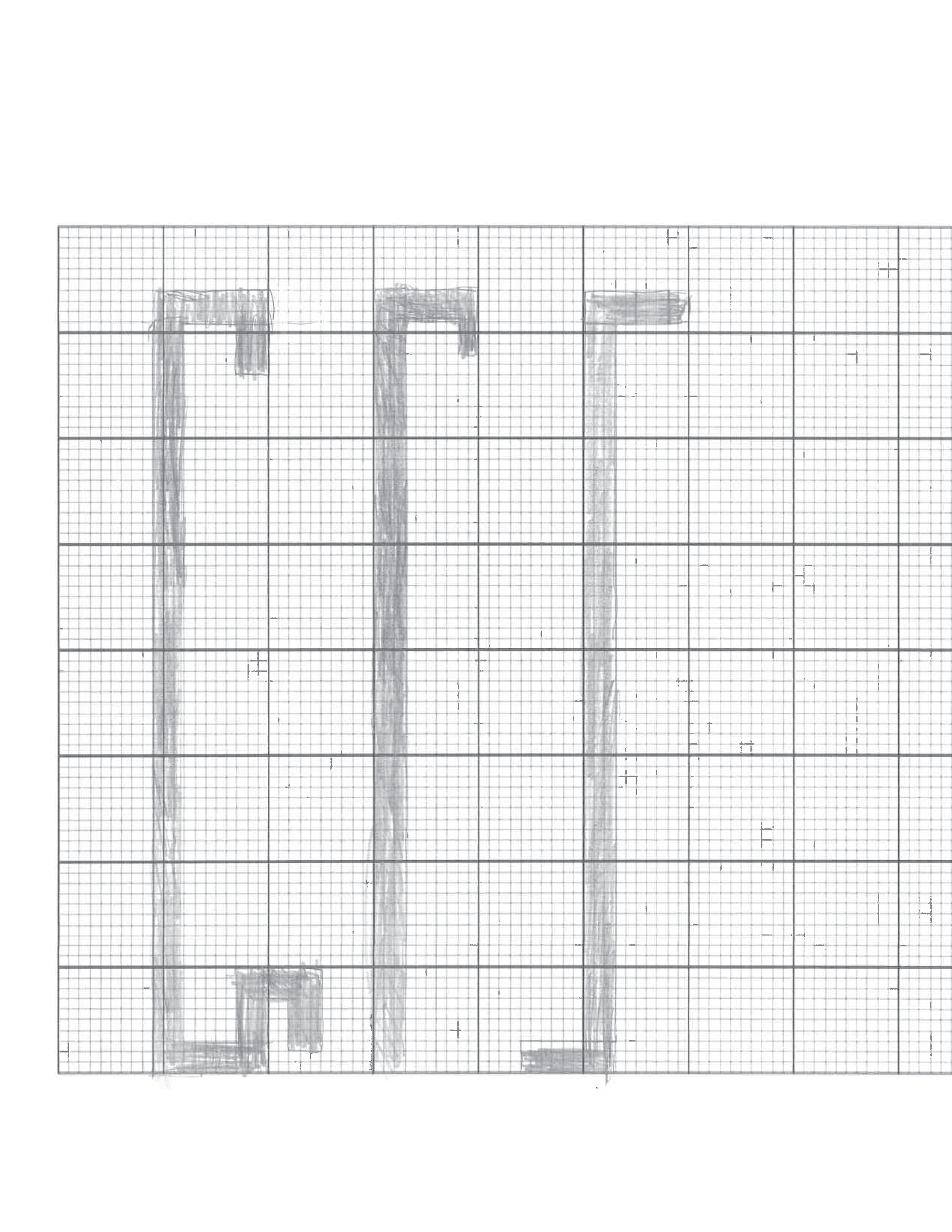
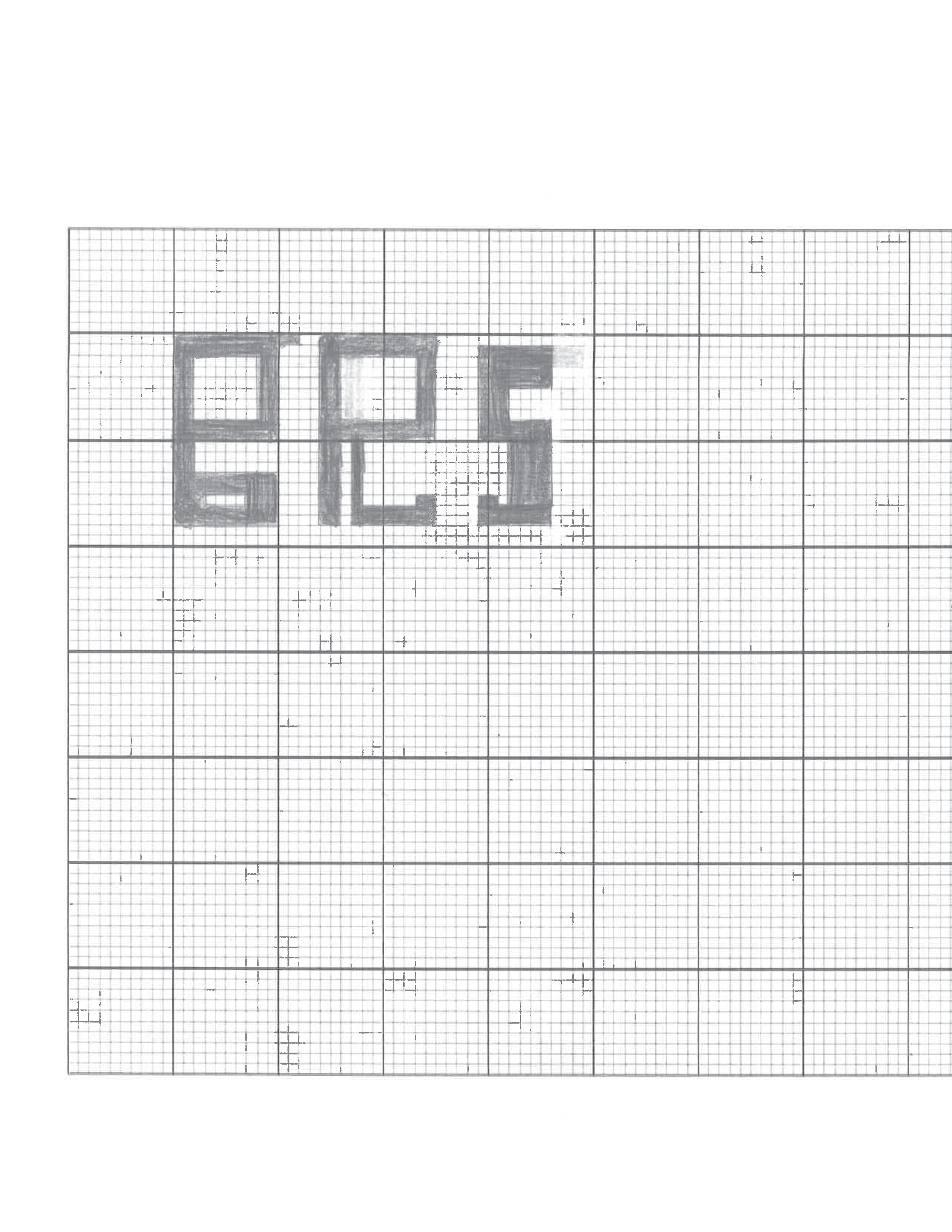
Before & After